How to Decorate With Travel Photography and City Art
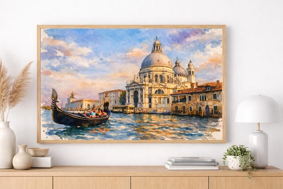
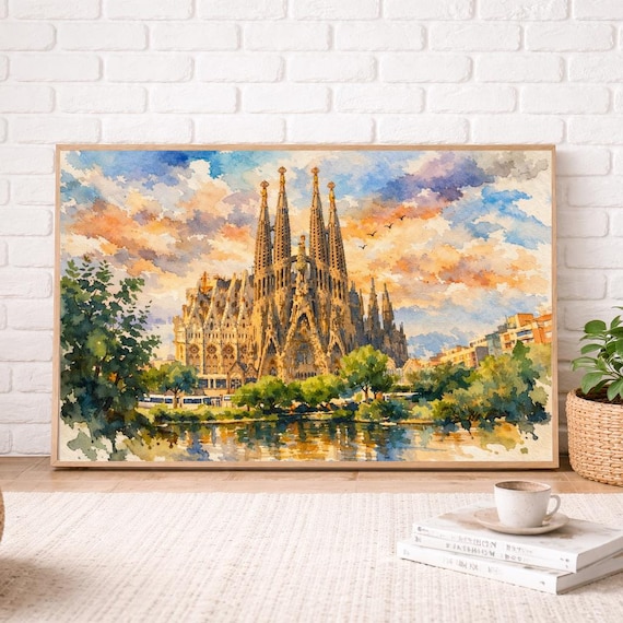
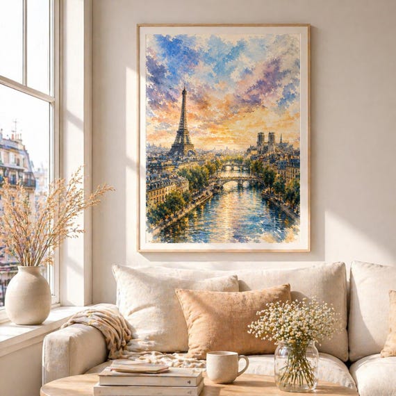
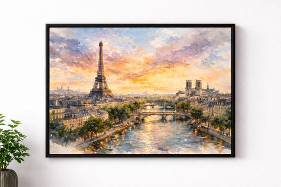
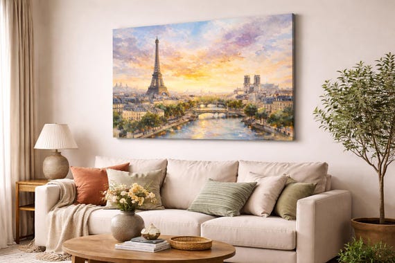
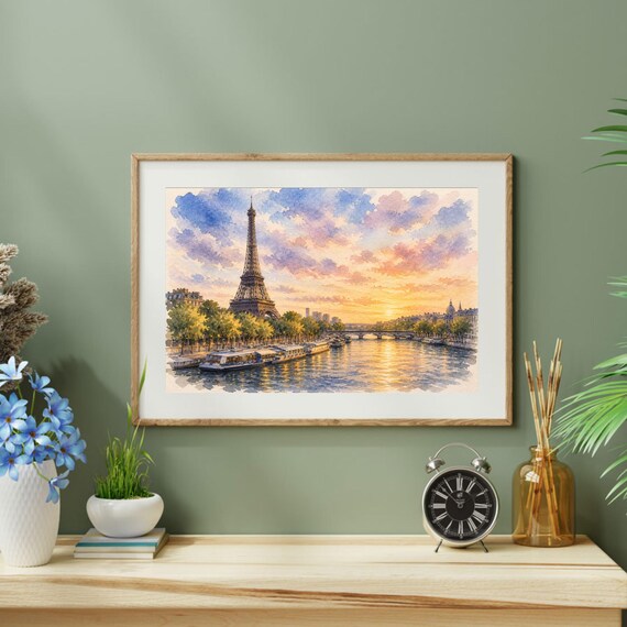
Travel decor works when it evokes atmosphere rather than listing destinations. Soft watercolor cityscapes capture light, weather, and skyline mood — a quieter alternative to dense photo collages of every landmark.
Art that feels like a souvenir, not a brochure
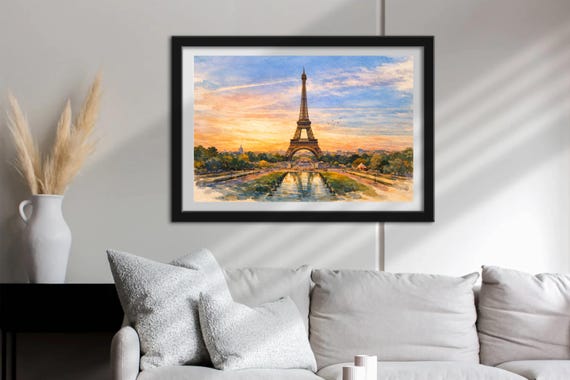
Choose cities you have visited or dream about visiting. A Paris print over a reading chair or a Tokyo skyline in a hallway can spark conversation without turning the room into a map mural.
Pairing watercolors with your own photos
If you display personal travel photography, keep frames consistent and let watercolor prints act as the artistic “chapter openers” for each trip. Place a watercolor of the city near a small cluster of your photos rather than mixing every print and snapshot in one chaotic grid.
Neutral mats help both mediums coexist. Avoid stacking too many high-contrast photos beside delicate washes of color.
Room-by-room travel styling
Living rooms suit larger statement cityscapes. Home offices benefit from calmer mid-size views that inspire without distracting on video calls. Entryways welcome a single memorable print that greets guests with a sense of place.
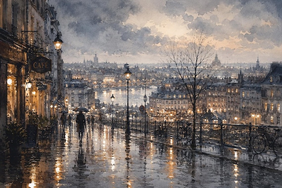
Bedrooms favor softer skies and quieter compositions — rainy Paris or evening waterfronts often feel more restful than dense midday skylines.
Featured prints
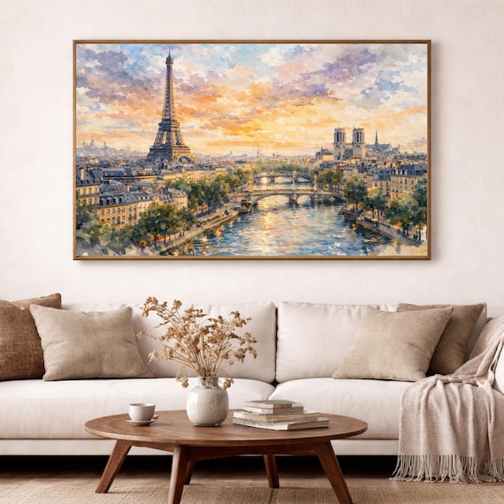
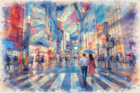
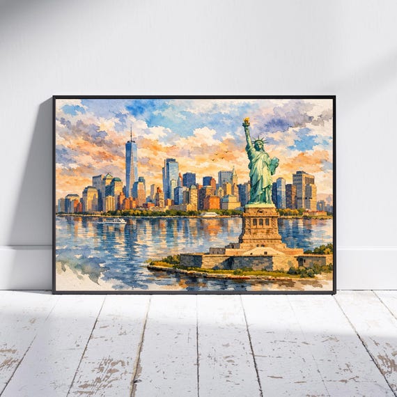
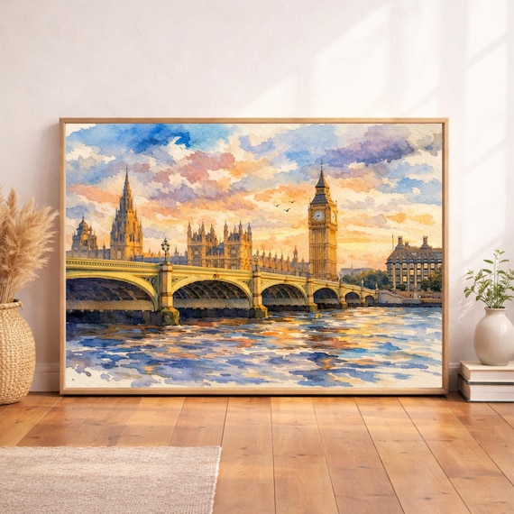
Shop related
Quick answers
- Should every print match a city I have visited?
- Not necessarily. Dream destinations and places that match your palette can work just as well as trip souvenirs.
- How many travel prints is too many?
- If you cannot name why each piece is there, edit. A focused set of three to five strong cityscapes usually beats a crowded wall of small mementos.